Four roles have different jobs
Background holds the content, Text sits on that background, Accent marks a control or meaningful visual, and On accent is the text on that accent. The preview uses those roles directly.

ONELESS / COLOR
An accessible palette needs more than attractive swatches: colors have to work in specific roles. This generator starts with a background that stays fixed, chooses black or white for body text, and searches near an accent seed for a usable accent and its text color. The result lists exactly which three pairings were tested.
Open Accessible Color Palette Generator. JavaScript powers the workspace; the full guide is available below.
UNDERSTAND THE RESULT
Background holds the content, Text sits on that background, Accent marks a control or meaningful visual, and On accent is the text on that accent. The preview uses those roles directly.
Text/background and On accent/accent use the selected normal-text target: AA 4.5:1 or AAA 7:1. Accent/background is tested at 3:1 for a meaningful boundary where that criterion applies. Other combinations are not automatically covered.
The background never changes. Mid-gray backgrounds may support neither black nor white at 7:1. Locking an unsuitable accent can also prevent a passing result. The tool shows those failures instead of claiming the palette is universally accessible.
HOW TO USE IT
A WORKED EXAMPLE
Set both background and accent to #FFFFFF and lock the accent. Body text remains black, but the accent/background pair is 1:1 and fails. Unlocking allows the accent lightness to change; the fixed background remains white.
EVERYDAY USES
Build a reading surface and a contrasting action color. Check hover, focus and disabled states separately; they are not generated here.
Lock a required accent and review the actual failures before deciding whether to change its use, its background, or the surrounding design.
LOCAL WORKSPACE
The tool processes color values locally. It does not upload the input to a processing server or save it in browser storage. Leaving or reloading the page clears the working state. Copying places the selected result on your clipboard; sharing sends only the page address without your working values.
These tools describe sRGB colors. Browser decoding, color management and the display can affect what you see; they are not an ICC proofing workflow or a print-color guarantee. Read the site privacy policy for information about the surrounding website.
KEEP IT NEARBY
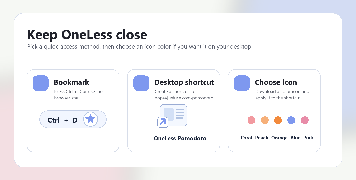
Press Ctrl + D on Windows or Command + D on Mac to bookmark this page. Your browser may also offer Create shortcut or Add to Home Screen. Shortcuts open the tool; they do not include your colors or images.
QUESTIONS, ANSWERED
No. Only the three named pairs are tested. Text on accent uses its own dedicated color, which may differ from body text.
The search preserves the seed hue and saturation while sampling HSL lightness in 0.1-point steps. Among candidates meeting the accent requirements, it chooses the nearest RGB value. It is not a perceptual optimization or a promise of the closest possible color.
The fixed background may not support 7:1 with either black or white. A locked accent can also fail. The report retains the actual ratios and explains which pair needs revision.
No. Contrast is one requirement. Information should also use labels, shapes or other cues rather than relying on color alone. Review the design with relevant accessibility testing.
The locked color is preserved. Review the reported result instead of assuming every swatch passed; unlock or edit the color if the target matters for that role.
Copying exports values, not a guarantee. Keep the displayed contrast results in mind when assigning roles, and recheck them on the actual background.
The intended comparison is each generated color against the selected fixed background. For other combinations, use Palette Contrast Checker to inspect the pairs explicitly.
REFERENCES
CSS color values — MDN · WCAG 2.2 text contrast — W3C · Enhanced contrast — W3C · Non-text contrast — W3C
ANOTHER SMALL STEP
Give every color a role. Check the pairs that matter.
Return to Accessible Color Palette Generator ↑ Soft Coral
 Warm Peach
 Sunset Orange
 OneLess Blue
 Rose Pink