A ratio from 1:1 to 21:1
The ratio compares relative luminance after linearizing sRGB channels. Matching colors produce 1:1; black and white produce 21:1. Swapping foreground and background preserves the ratio.

ONELESS / COLOR
Color contrast is about how a foreground reads against its background. Enter two opaque HEX colors, inspect the text specimen and read the calculated ratio. Separate normal and large text results explain which WCAG contrast thresholds the pair meets.
Open Color Contrast Checker. JavaScript powers the workspace; the full guide is available below.
UNDERSTAND THE RESULT
The ratio compares relative luminance after linearizing sRGB channels. Matching colors produce 1:1; black and white produce 21:1. Swapping foreground and background preserves the ratio.
AA requires 4.5:1 for normal text and 3:1 for large text. AAA requires 7:1 and 4.5:1 respectively. Large text means at least 24 CSS pixels, or 18.67 CSS pixels when bold.
The displayed ratio is rounded to two decimals for readability. Pass/fail uses the underlying value without rounding: a value just below 4.5 still fails the 4.5 threshold.
HOW TO USE IT
A WORKED EXAMPLE
Black text on white gives 21:1 and passes all four checks. #777777 on white gives about 4.48:1: it fails normal-text AA even though it passes large-text AA.
EVERYDAY USES
Test the intended text and surface colors before applying them. Focus indicators, borders and other non-text parts need their own assessment.
Copy the pair and its result into a review note, then adjust a color and compare the updated ratio.
LOCAL WORKSPACE
The tool processes color values locally. It does not upload the input to a processing server or save it in browser storage. Leaving or reloading the page clears the working state. Copying places the selected result on your clipboard; sharing sends only the page address without your working values.
These tools describe sRGB colors. Browser decoding, color management and the display can affect what you see; they are not an ICC proofing workflow or a print-color guarantee. Read the site privacy policy for information about the surrounding website.
KEEP IT NEARBY
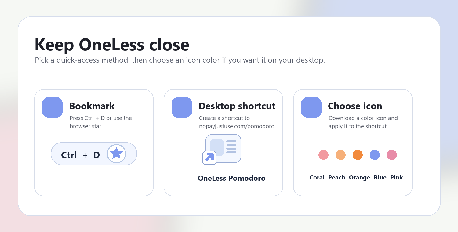
Press Ctrl + D on Windows or Command + D on Mac to bookmark this page. Your browser may also offer Create shortcut or Add to Home Screen. Shortcuts open the tool; they do not include your colors or images.
QUESTIONS, ANSWERED
No. This is a color-pair test for text contrast. Structure, keyboard access, labels, states, images, non-text UI contrast and other requirements are separate.
This version accepts two opaque solid colors. For transparency, first determine the final composited color; for a gradient or photograph, assess the actual backgrounds beneath the text.
The ratio is mathematically symmetric, but font weight, antialiasing, surrounding colors and visual context can affect perceived readability.
The sRGB relative-luminance ratio and text thresholds described in WCAG 2.2. Decisions use the unrounded ratio.
Put the lettering color in Foreground and the surface behind it in Background. Review the sample using the same roles you intend to use in the design.
Identical colors have a ratio of 1:1. Opaque black and white reach 21:1 in the sRGB calculation. Higher ratios indicate a larger luminance difference, not a rating of how attractive the pair is.
Try making the foreground darker or the background lighter, or reverse that direction for light text. Recheck the pair after each change; changing hue alone may have little effect on luminance contrast.
REFERENCES
CSS color values — MDN · WCAG 2.2 text contrast — W3C · Enhanced contrast — W3C · Non-text contrast — W3C
ANOTHER SMALL STEP
See how two colors read together, and understand the ratio.
Return to Color Contrast Checker ↑ Soft Coral
 Warm Peach
 Sunset Orange
 OneLess Blue
 Rose Pink