Rows are text, columns are backgrounds
Each matrix cell previews its row color as text on its column color. Reversing the pair preserves the mathematical ratio but changes the specimen. Select a cell to see a larger example.

ONELESS / COLOR
A palette can look coherent while offering only a few readable text pairs. Palette Contrast Checker turns an existing set of colors into a comparison matrix. See every foreground/background combination, inspect a selected pair, and export a report for the exact contrast target you chose.
Open Palette Contrast Checker. JavaScript powers the workspace; the full guide is available below.
UNDERSTAND THE RESULT
Each matrix cell previews its row color as text on its column color. Reversing the pair preserves the mathematical ratio but changes the specimen. Select a cell to see a larger example.
Choose 4.5:1 for normal-text AA or large-text AAA, 7:1 for normal-text AAA, or 3:1 for large-text AA. Large text means at least 24 CSS px, or about 18.67 CSS px when bold. These are text-color checks, not a whole-page accessibility certification.
Matrix ratios show two decimals. Pass/fail compares the full unrounded value. The summary and CSV count each unordered pair once, excluding the diagonal; duplicate input colors remain separate positions and produce a 1:1 pair.
HOW TO USE IT
A WORKED EXAMPLE
Enter #000000, #777777 and #FFFFFF. Black on white is 21:1. #777777 on white is about 4.48:1, so it fails 4.5:1 normal-text AA. Rounding is never used to turn a near miss into a pass.
EVERYDAY USES
Paste the approved colors and discover which pairs can support text. This checker does not change or generate colors.
Inspect dark-on-light and light-on-dark specimens before assigning text and background roles. Use Accessible Color Palette Generator if you want help generating role colors.
LOCAL WORKSPACE
The tool processes color values locally. It does not upload the input to a processing server or save it in browser storage. Leaving or reloading the page clears the working state. Copying places the selected result on your clipboard; sharing sends only the page address without your working values.
These tools describe sRGB colors. Browser decoding, color management and the display can affect what you see; they are not an ICC proofing workflow or a print-color guarantee. Read the site privacy policy for information about the surrounding website.
KEEP IT NEARBY
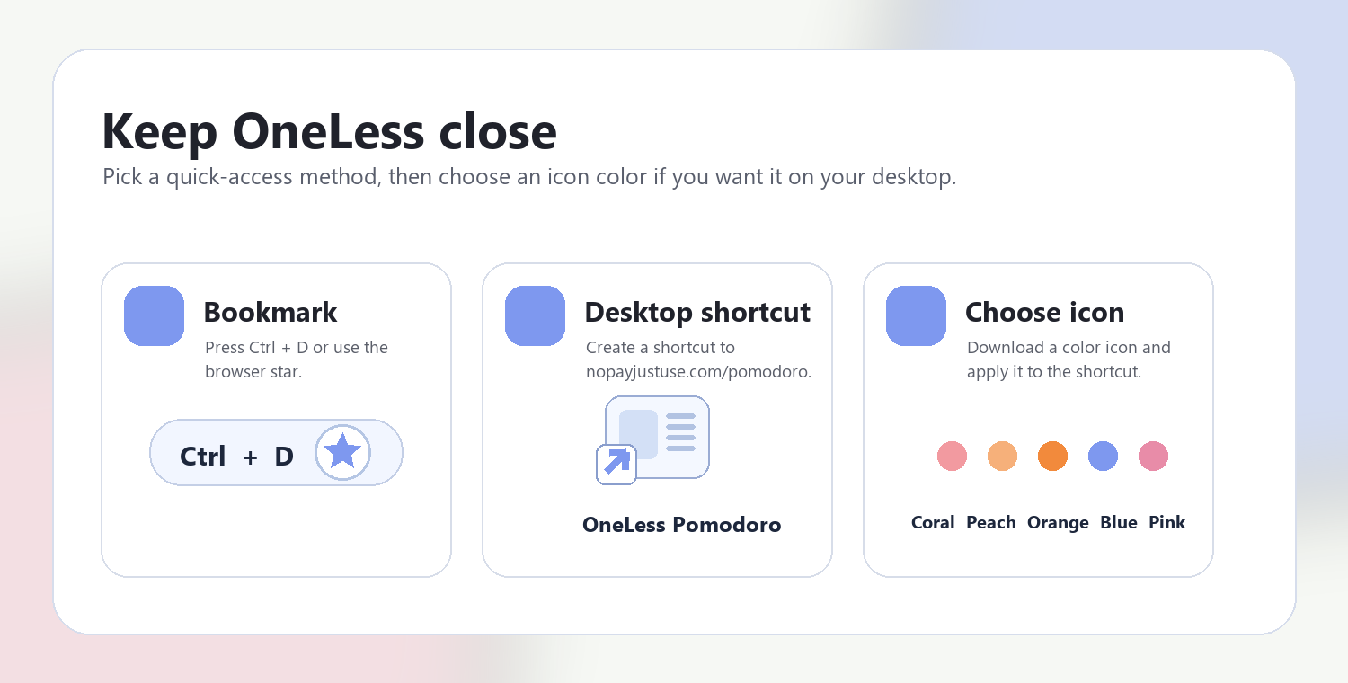
Press Ctrl + D on Windows or Command + D on Mac to bookmark this page. Your browser may also offer Create shortcut or Add to Home Screen. Shortcuts open the tool; they do not include your colors or images.
QUESTIONS, ANSWERED
No. A pass applies to that solid text/background pair at the selected threshold. Font size, weight, focus indicators, icons, meaning conveyed by color, and other accessibility requirements still need separate checks.
No. First composite transparency against its actual surface, then use the resulting opaque HEX. Photographs and gradients need evaluation of the actual background behind the text.
For n input positions, the report contains n × (n − 1) ÷ 2 pairs. Four colors produce six pairs. The visual matrix also shows reversed pairs and the 1:1 diagonal for orientation.
No. It evaluates your input unchanged. Use a palette generator or Color Picker to create alternatives, then bring them back for comparison.
Enter two to eight opaque HEX colors. Read a matrix row as the foreground and a column as the background, then inspect the pairs you actually plan to use together.
Opaque color contrast is mathematically symmetric. Foreground and background roles still matter when you preview text and decide how to apply the colors.
Use it to review the ordered foreground/background combinations and their results outside the tool. Self-pairs are omitted. Keep the selected target with your review so a pass or fail has context.
REFERENCES
CSS color values — MDN · WCAG 2.2 text contrast — W3C · Enhanced contrast — W3C · Non-text contrast — W3C
ANOTHER SMALL STEP
Every pair in your palette, compared in one clear view.
Return to Palette Contrast Checker ↑ Soft Coral
 Warm Peach
 Sunset Orange
 OneLess Blue
 Rose Pink